How Browser Tabs Changed the Way We Multitask on Screen
Browser tabs made switching between pages feel effortless. Learn how that changed screen multitasking and choose a clearer way to handle open pages.
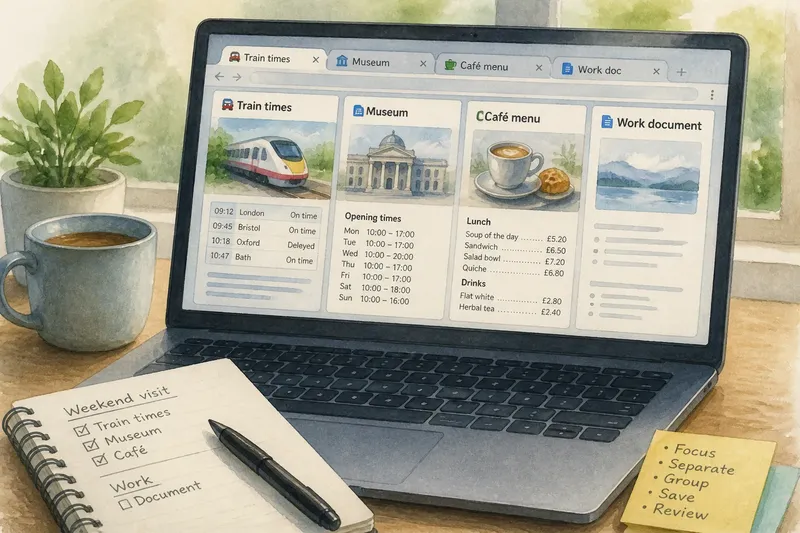
You open a recipe, check a message, then look up a train time; soon the browser’s tab strip is a row of tiny favours to your future self. Browser tabs made screen multitasking easier by gathering pages in one window, and that convenience changed how people moved between tasks. But quick switching and organised work are not the same thing.
Before tabs became a standard browser feature, several pages often meant several windows, each taking up screen space. Tabs gathered those pages behind a row of titles and icons. It was a little like putting papers in the same folder: easier to keep together, but not automatically easier to sort.
Browser tabs turned page switching into a habit
With tabs, a page could remain open while attention moved elsewhere. A news story could sit beside a map; a reference page could stay available while you filled in a form. Instead of opening and closing windows, you could switch with a click, keyboard shortcut or touch.
That small interface change encouraged a different rhythm. People could move between a message, a search and a document without treating each as a separate browsing session. The browser began to feel less like a single destination and more like a workspace with several active doors.
The tab strip, however, reveals only a little about what is behind each door: perhaps a short title, a site icon and a close button. As the row fills, titles become harder to read and unrelated tasks sit side by side. Tabs made switching simpler, but they left people to decide what deserved to stay open.
Fast switching can blur the boundaries between tasks
An open tab says, “I can return to this page quickly.” It does not explain why the page is there or what should happen next. You might be comparing two travel options, keeping a page handy while you finish a form, or leaving a message open while waiting for a reply. The pages look alike in the tab strip, though their purposes differ.
When work, errands and leisure share one long row, it can be harder to see where one activity ends and another begins. The browser does not know which pages belong together. A tab is a doorway, not a filing system.
This does not mean every open page is a distraction. For some tasks, switching between several sources is useful. The practical question is whether the pages support one current activity, represent separate contexts, or form a project that you expect to revisit.
Three ways to organise tabs suit different tasks
A small active set suits focused work
Keep the pages needed for one clear task in view when you are filling in a form, comparing timetables or drafting a message from a reference page. A shorter row makes titles easier to recognise and helps reveal when an unrelated page has slipped into the session.
This can be awkward when a task relies on many sources that you need to revisit quickly. The aim is not a strict tab limit; it is to keep the active pages connected to the work in front of you.
Separate windows suit distinct contexts
Different windows can give separate activities their own visual space. On a large screen, you might keep work pages in one window and personal errands in another. This boundary is useful if you can recognise each window by its contents or position.
Overlapping windows can become confusing, especially when their tabs look alike. If you often search through several windows to find a page, the separation is not helping. A single window with clearly named groups may be easier to scan.
Tab groups suit related strands of a project
Some browsers let you group tabs and give each group a name or colour. A group called “Weekend visit” might contain a rail timetable, a museum page and a café menu. The label provides context that a row of page titles may not, and the group can often be collapsed while you focus elsewhere.
Groups work best when the pages genuinely belong together. A passing search may not belong in a project group, and a vague label such as “Research” may be less useful than a name tied to a specific activity.
Choose a tab arrangement by what you need to find
Before sorting pages, consider the task and how you will recognise its pages later. The following checks connect an observable detail to a practical decision:
- Check whether the pages support one short task. If they do, keep a small active set; if they do not, separate unrelated pages into windows or groups.
- Check whether two contexts are easy to tell apart. If you can identify each window at a glance, use separate windows; if not, keep the pages together under clear group names.
- Check whether several pages belong to a continuing project. If they do, create a group named for the project; if they do not, leave them ungrouped or close the pages you no longer need.
- Check whether a page is needed in the current session. If you will use it now, keep it open; if you only want a route back to it later, save a bookmark or use a reading list.
- Check whether a tab still has a clear purpose. If it supports an active task, keep it; if it does not, close it after deciding there is no reason to return.
- Check whether the tab strip shows enough of each title. If titles are legible, the strip may be sufficient; if they are cut off, use the tab switcher, named groups or separate windows.
Imagine you are planning a weekend visit and have opened a rail timetable, a museum’s opening page, a café menu and a work document. The starting point is four open pages, with no groups. First, identify the three travel pages as one continuing task and put them in a group called “Weekend visit”. Next, move the work document to a separate window if you need to switch between work and planning. If the museum page is no longer needed during the current session but may help with another visit, save it as a bookmark instead. The resulting arrangement keeps the travel pages recognisable as a project, separates the work context, and removes the museum page from the active row; the trade-off is that you must open the bookmark when you need that reference again.
Which tab choice fits the way you browse?
Are bookmarks better than leaving tabs open?
Use a bookmark when you want a saved route to a page but do not need it in the active session. Keep a tab open when you expect to use the page as part of the task in front of you.
Do tab groups return after you close the browser?
That depends on the browser and its settings. If a group must be available later, check the browser’s session and start-up controls rather than assuming the group will return.
Can a long row of tabs cause problems?
It can make pages harder to identify, and some pages may use device resources while open. If switching becomes confusing or the browser feels sluggish, sort the pages by task and close those without a clear current purpose.
How should I manage tabs on a phone or tablet?
Small screens often hide most tab titles, so the browser’s tab switcher or group view can be easier to scan than a crowded strip. Choose the view that lets you identify a page by its title or purpose, not just by its position.
Use labels that explain why a page is open
Short, specific group names make the tab strip more informative. “Tax documents” or “Garden ideas” tells you more than “Research”, especially if several activities are open at once. If your browser does not offer groups, separate windows can provide a similar boundary when you can recognise their contents.
When a task ends, decide what should happen to its pages. Close pages with no continuing purpose, keep active project pages together, or save a bookmark when you need a route back but not an open tab. For browser tabs and multitasking, the useful habit is to make each open page’s role clear: active work, a distinct context or part of a named project. If you cannot say which role it has, it may be time to close it.